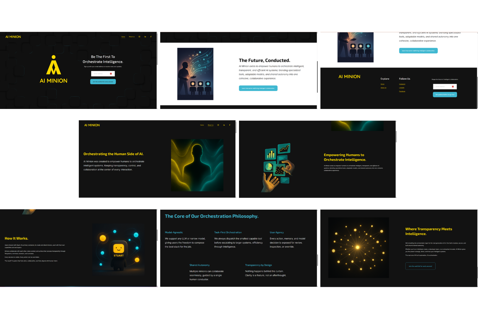
AI Minion Branding and Website
When designing brand identities, I’m drawn to modern, clean aesthetics with simple lines, as they allow the graphic elements to stand out without unnecessary distraction. With AI Minion’s brand identity, I applied this approach while incorporating the client’s requested graphic elements, using rounded forms and a bold color palette of yellow, black, white, and turquoise to create a cohesive and approachable visual system.
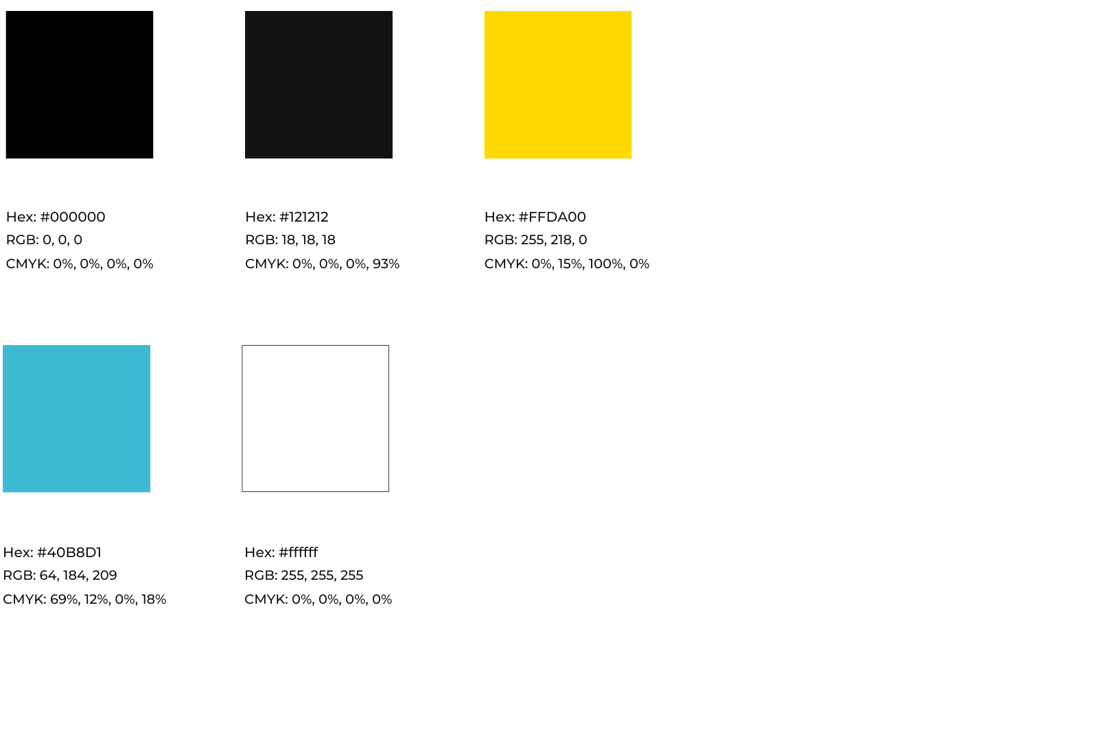
Color Palette
The client had already wanted yellow to be the core brand color, so in choosing the shade, I wanted it to represent energy, intelligence, and human creativity to go with the theme surrounding AI Minion. I added turquoise as a secondary color to symbolize innovation, clarity, and advanced technology. This will primarily be used for motion, highlights, and digital glow. The off black was added for a more sleek, modern base that adds depth and focus. Used for dark mode and surfaces. While, black and white will be used sparingly.
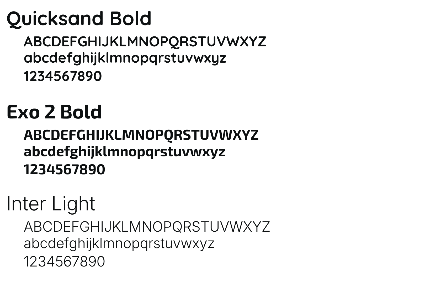
Typography
For typography, I chose Quicksand Bold for the logo because I wanted it to be modern and intelligent, but still be approachable, which this achieves with the rounded edges. Exo 2 is perfect for headers and sub-headers because it is sleek, futuristic, and structured. While Inter Light is crisp, neutral, designed for digital readability making it perfect for paragraphs.
Initial Draft
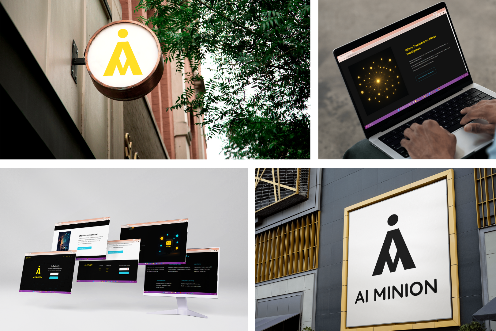
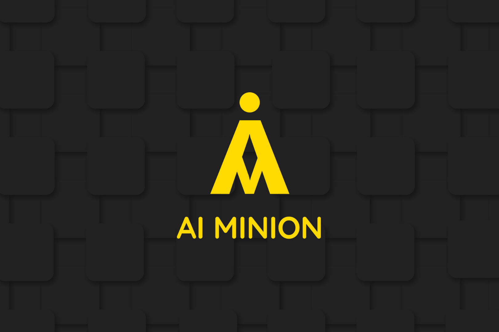
Final Logo
Logo Lockups
Website
https://ai-minion.com/
Environmental Contact